
Tengrinews.kz – For the first time since 2015, Google has redesigned its iconic “G” symbol. The new version features color segments that now blend smoothly into one another, making the logo appear brighter and more modern.
This was reported by the tech portal 9to5Google.
The article notes that on September 1, 2015, Google significantly updated its main logo by switching to the modern Product Sans font. At the same time, the classic icon was changed: instead of a lowercase white “g” on a blue background, a circular symbol was introduced — which remained unchanged for nearly 10 years.
“Google is now updating the icon so that there are no longer four solid color sections. Instead, red bleeds into yellow, yellow into green, and green into blue. It looks more vibrant and colorful,” the publication says.
It is explained that the new style aligns with the Gemini gradient, and a similar visual approach is used in AI-powered features in Google Search for shortcuts.
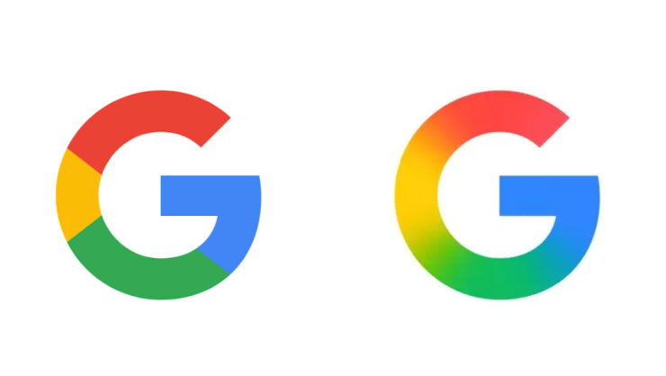
Screenshot of logos
The updated icon is already in use in the Google Search app for iOS. As of Monday, it also appeared on Android in the beta version of the Google app 16.18.
“It’s a subtle change that you might not immediately notice, especially if the main place you see it is on your homescreen. It will be even less noticeable as a tiny browser favicon,” the article adds.
Meanwhile, the publication notes that there is currently no indication that Google plans to update its primary six-letter logo. It also remains unclear whether the logos of other Google products will be changed.